top of page
GABRIELA CÁRDENAS

About the project
This case study started as a design diagnostic for a design challenge.
Type of work
-
Double diamond methodology
-
Problem
-
Planning
-
Solution
-

Context
mipromo.com is an exclusive page for BAC Credomatic card users, which provides privileges and coupons from different businesses nationally and internationally.

User Personas


Competitive & Comparative Analysis
This analysis provided strategic insights into the features, functions, flows, and feelings evoked by the design solutions of the competitors.
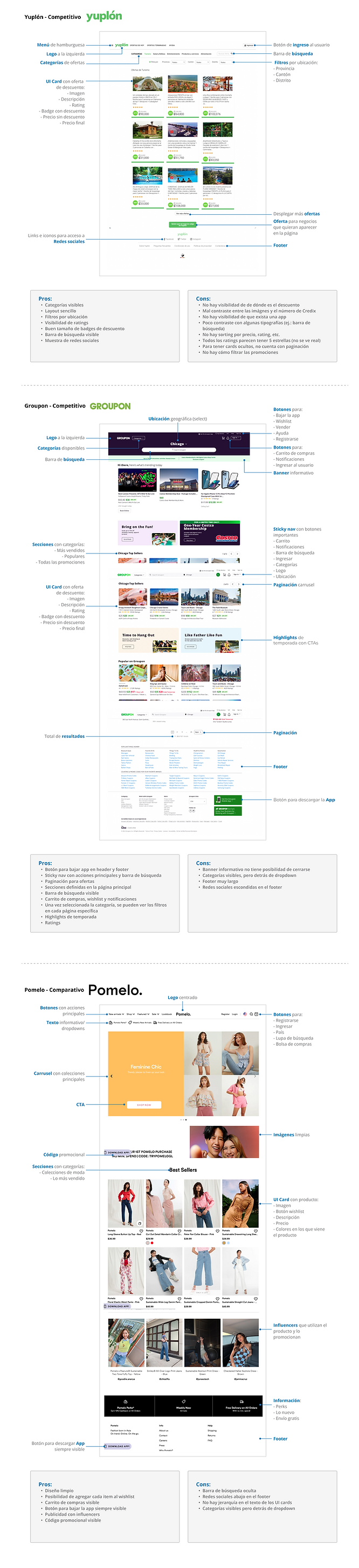
Common Features
After analyzing the data, we identified the most common features and determined the minimum requirements for building the page.
-
Yuplón: has a simple layout with visible categories, search bar, and social media buttons. The ratings are also easily visible.
-
Groupon: has a shopping cart, wishlist, and notification features. The main page is divided into defined sections with pagination for offers. The app download button is present in both the header and footer. Upon selecting a category, the filters are visible on each page. They also have seasonal highlights.
-
Pomelo.: has a clean design and offers the option to add items to a wishlist. They have an app download button that is always visible and advertise with influencers.

Note
It is important to measure the performance of a website in the research phase. This involves analyzing analytics and conversion funnels to identify areas for improvement. By collecting data, it is possible to support design changes and create a baseline for future comparisons. This way, it is feasible to measure the effectiveness of any design changes and determine whether they have helped improve the site's conversions.
Heuristic Evaluation
The heuristic evaluation was conducted to identify common usability issues with MiPromo, resolve them, and improve user satisfaction, experience, and digital product success.
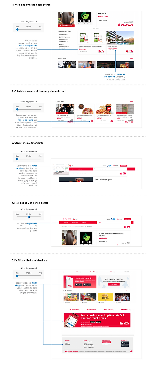
Heuristic evaluation takeaways
1. Visibility of system status: Many of the promotions have a specific expiration date.
It is not visible if the promotion is going to expire in an hour, or there is still time to buy without rushing.

2. Match between system & real world: The social media buttons are visible at the top of the page, but are often also searched for in the footer. They could be added in the footer below to follow the standard.
3. Consistency & standards: When the special offer option comes visible, it seems more like a gift card than a special offer.
4. Flexibility & efficiency of use: There is no search engine suggestion before you finish typing a word in the search bar.

5. Aesthetic & minimalist design: The ads to download the app are shown several times. In the middle of the page, at the bottom, and in the footer.
Problem
BAC aims to enhance the user experience of https://mipromo.com's homepage for customers who have accounts with them. To achieve this, they have decided to conduct a design diagnosis to identify the users' needs and frustrations while using the page to acquire promotional coupons.
The research findings will be used to simplify and speed up the interaction of different types of end-users with the promotion purchase page, thereby increasing customer satisfaction and sales volume.
Mockup of redesign


bottom of page